It took me many more weeks to decide which topic to dedicate my essay to than most others. I looked at different aspects of animation that included inbetweens and the history of it, but none of these topics grabbed me enough to want to write about. When talking to Johny to get advice about how to choose my topic I was suddenly struck with inspiration based on a previous task I had to complete. My main interest is in film and the construction of it, something many people wouldn’t know too much about. Why not try and write an essay to open that door to people and perhaps get someone looking at film a little deeper?
Statement of Intent
This was my first ever time hearing of or completing a Statement of Intent, so the process of learning how to format it was a little challenging to begin with. I used the library search resource on the student channel to find all the books I thought were remotely related to my subject as well as personally visiting the library to look through the shelves. This gave me the basis of the resources I wanted to use. I completed my first draft quickly to the best I felt I could, and under-confidently I sent it in to Johny.
I then went to the library with the structure of the essay in mind, found and collected all the books I wanted to use and started scouring through them to find quotes and sections that fit into one the paragraphs I wanted to write. It started slowly at first which was off putting, but I eventually found some excellent quotes which boosted my confidence. During this process I learnt a lot about how to read a book intelligently. Instead of aimlessly searching for quotes, I used the index or contents page to find subjects of interest and scanned quickly until something grabbed my eye.
The biggest thing I would do differently next time would be to Harvard reference the quotes as I collect them and to live update the Statement of Intent as resources come and go. I didn’t use over half of the resources I found, and it was difficult to go through and remove the ones that didn’t need to be in the Statement of Intent. I would also try and stick closer to the schedule I made as to ensure an even distribution of time across modules.
Statement of Intent Draft 1
| Day | Mon | Tue | Wed | Thu | Fri | Sat | |
| Week | |||||||
| 1 | Res | Res | Res | Res | Res | Res | |
| 2 | Res | Res | Res | Res | Res | Res | |
| 3 | Layout | Layout | Layout | Layout | Layout | Layout | |
| 4 | Res | Res | Res | Res | Res | Res | |
| 5 | First Draft | First Draft | First Draft | First Draft | First Draft | First Draft | |
| 6 | Layout Revise | Layout Revise | Layout Revise | Layout Revise | Layout Revise | Layout Revise | |
| 7 | Second Draft | Second Draft | Second Draft | Second Draft | Second Draft | Second Draft | |
| 8 | Images & Art | Images & Art | Images & Art | Images & Art | Images & Art | Images & Art | |
| 9 | Third Draft | Third Draft | Third Draft | Third Draft | Third Draft | Third Draft | |
| 10 | Final Draft & Layout | Final Draft & Layout | Final Draft & Layout | Final Draft & Layout | Final Draft & Layout | Final Draft & Layout |
Inspiration & Research
Without realizing I had done so, I chose my methodology before I started the layout of the essay. I’ve always preferred minimalism and simplicity in my work, and after a Monday afternoon Context lecture I learned about choosing a methodology. Occam’s Razor is one these, which is the principle that states that elements that aren’t needed should be pared back to produce something simpler. The KISS methodology is also my other chosen one – which simply means Keep It Simple, Stupid.
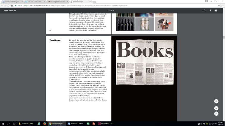
I read a lot of the Vignelli Canon design book which helped inspire me on the use of my grid margins and the original title before I change to the second draft. An article that was shared among the class was also helpful and gave me some inspiration. It was on the topic of ‘desire paths’ and how they can lead to better design. Desire trails are patches of grass a lot of people walk across as a shortcut. I learned from this that people are lazy and want the quickest way to do something typically, so with my design why not make it User-centered designed as well (another methodology) and make it as simplistic and quick as possible. The less is on a page, the more likely a reader will want to read. If too much was on the page it would be off-putting and people would only skim if not pass of my article completely.
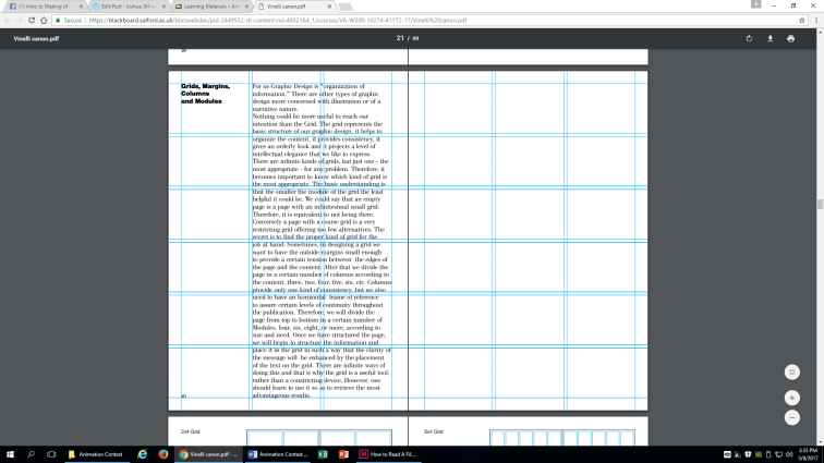
I wanted to use a simple 6×3 grid margin with a 4mm gutter to layout my design. Much of this was new to me as I had never used In-Design before and knew nothing about gutters, margins, kerning and much else. The process of researching design was fascinating to me as I got to peel back the way everything graphical was layed out. I learned of production practices in the use of placement text (without any images or words being written, you can layout a design with placeholder items), about the way text should be layed out (not across one page but in columns typically) and much more.
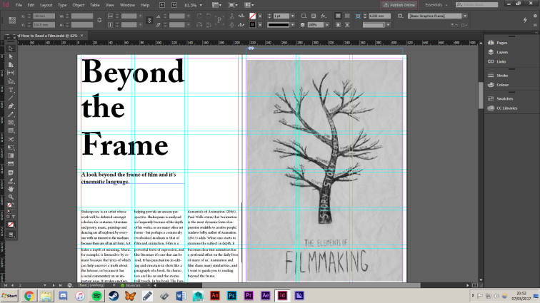
The title of my first layout draft was also inspired by the book.


I then developed and created a Moodboard of similar magazine spreads that inspired me and that I wanted to implement into my own design.
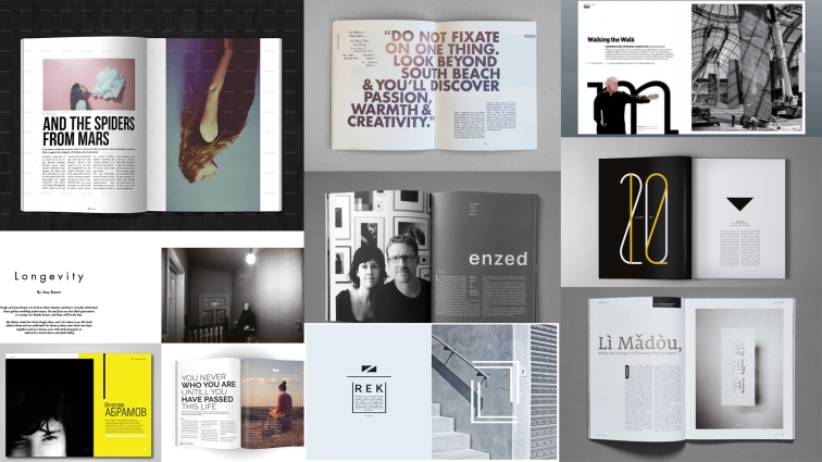
All these designs share a similar layout in the empty space and very minimalist text and pictures. The pages are sparse and the opposite of cluttered. I love this design and kept it in mind when planning my own design.
This was an extremely helpful video when first beginning to consider my layout and composition of the design. It’s 5 simple points on how to create a good design was highly important for me to consider while crafting the design. The proximity, I learned, is to use visual space to show relationship in your content, which when it’s said becomes obvious to me. There’s so much I already know about about design but needed pointing out, because it seems silly to say that content on a page should relate to each other, but when considering design it’s important to know.
White Space, Alignment, Contrast and Repetition were all something else pointed out to me, giving me a clearer understanding of their use in graphic design and layout. Without this in mind I feel like my first layout would have been a jumbled and misguided mess.
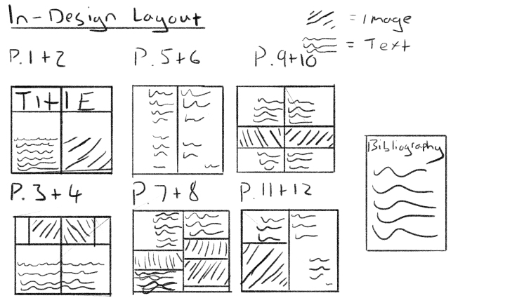
In-Design Laouts
The first draft of my essay was a good foundation for style and effect I wanted to go for when designing the layout, but there are some dumbfounded decisions that I later corrected. As I said earlier, this is an entirely new learning process so of course mistakes were going to be made for the first draft of my design.
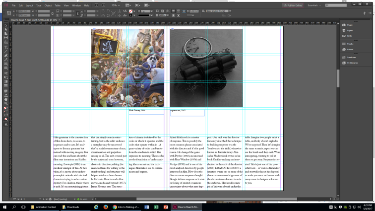
Some of these included the use of text going across an entire page. After looking more closely at the moodboard and examples from other magazines (such as GQ) I found that text is typically presented in columns, and that the whole spread will stick to the same rule. The use of the photo on the title page is poor also, as it doesn’t line-up with the text to the left, and the empty space below the title is too much. I didn’t know any of this before, so I took the criticism and later change it.
Some other issues included problems with in-text citations, quotes, the layout of images and other minor mistakes.


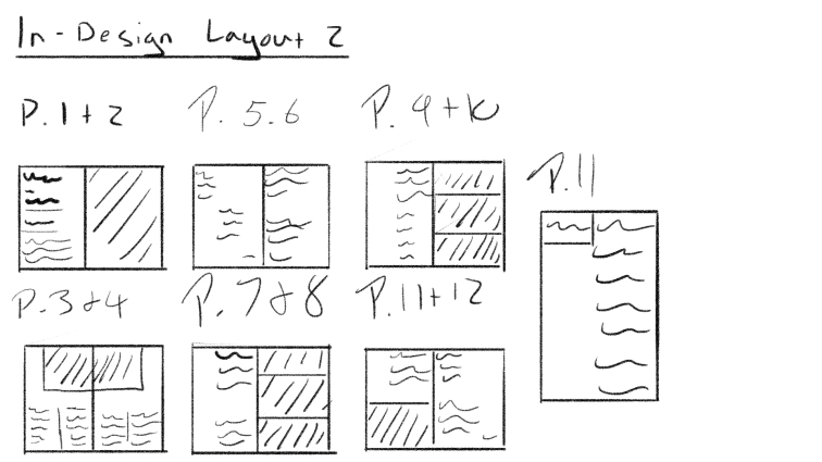
I slept on it and looked at it again with fresh eyes and the advice for changes still in mind and made some adjustments. Lowering the font size from 18 to 13 helped give me much more room to work with on the page. I then columned all the text of the pages and moved the pictures around to have extra symmetry. The title page was also change with the addition of a sub-heading, something that helps to guide the eye from the title to the text. Another big change was that instead of using an obvious two-page spread, it can now be read page-by-page. It certainly works better as a spread I think, especially visually, but it works as both now.


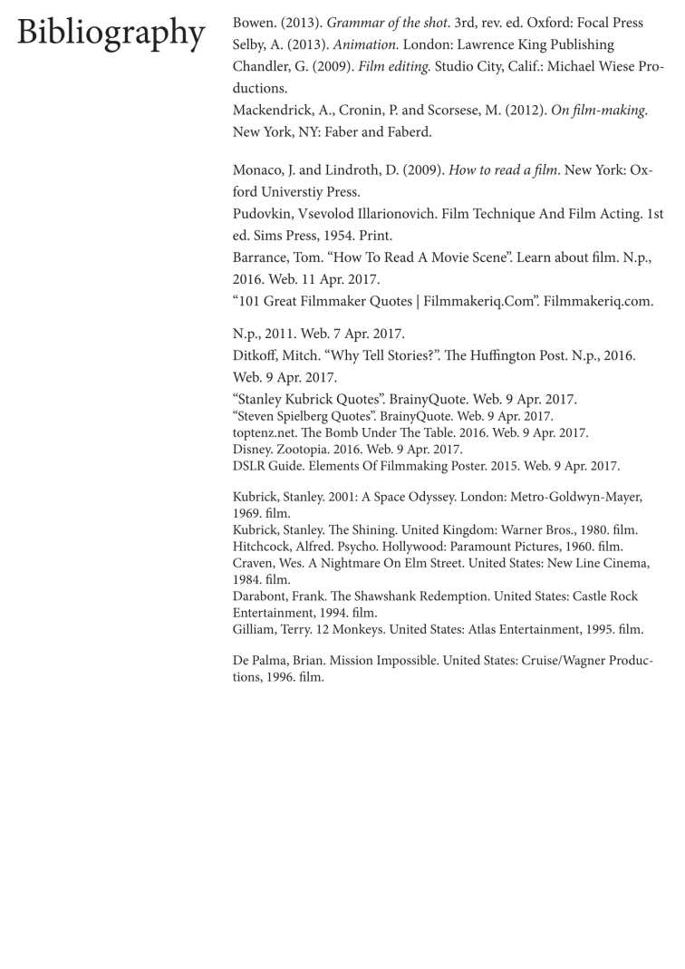
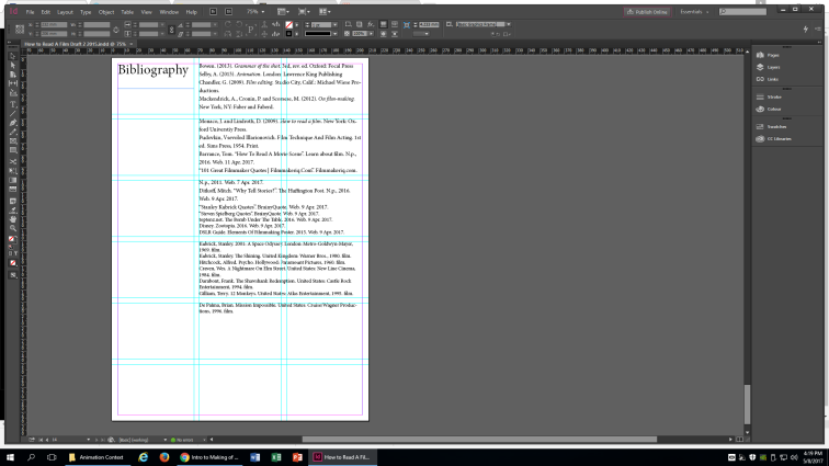
For my second and final draft of the layout I included the bibliography in the document at the end and Harvard references all images, quotes and references. After the Library visit in our lecture several weeks ago to teach us about referencing, I felt quite confident in it. After finally doing what I feel is a professional bibliography, I can say I feel much more confident and strong with referencing and plan to take it seriously in the future as well.
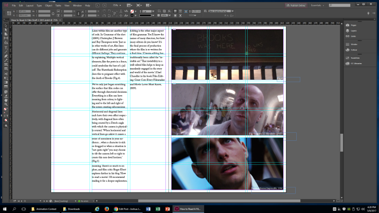
Here are the behind the scenes of the layout design: